 Gernene
From Walcott to Web
May 12, 2019
Apparently, you can turn a senior Language Arts final into a fun web design project.
Two days ago, I completed the only final I’ve ever enjoyed. Instead of writing an essay or taking some vocab test, my senior IB Language Arts class made graphic novels. A creative writing and art project in one? The assignment was already right up my alley, but I found a way to make it even better.
And bearable. Especially considering the fact that my other tests and finals have been raining down in a steady stream of death.
While most students made their graphic novels with good-ol’ pen and paper, I got permission to do mine entirely digitally. Turns out, crafting a webtoon from scratch is a great way to explore digital art, nifty CSS tricks, and general design principles.
Ideas and Content Creation
As much fun as I had making the webtoon, I still had to deal with the fact that it was going to be worth about 10% of my grade. While few in number, there were spcific requirements the project had to fulfill:
- A good story with a beginning, middle, and end
- A minimum of 6 pages and 12 frames
- Contain a “deep” political/philosophical message
- Must be completed in about a week
I decided to create my graphic novel based on my WIP fantasy novel Sun Slayer. This was an easy decision due to the multitude of advantages:
- Defined pre-existing characters
- An existing plan of major events that would need to occur in the chapter
- Sun Slayer’s existing focus on existential themes
- Chance to recycle the content for personal use - including the larger novel itself
With all these thoughts in mind, I opted for a very minimal approach to the webtoon that would complement Sun Slayer’s atmosphere while also making content as reusable as possible. Instead of treating images and text as a combined “frame”, I would create a list of major chapter events and attempt to depict them through illustrations alone. Text would be added via HTML once images had already been assembled on web - and only to communicate more complicated thoughts/character musings.
Style Development and Visual Expression
Art Style
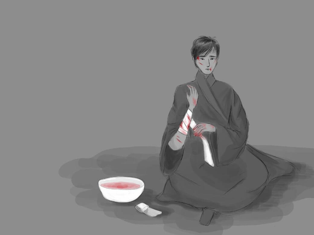
Because of time constraints, I chose a simple, less refined style for the illustrations. I’d scrawl what I would normally use as a sketch and then color everything in some shade of grey. I wanted to focus less on little scenic details and embilishments, more on emotions and interactions.
Contrast
I tried being more mindful of contrast. There was a demand to make certain parts of each illustration stand out, so I experimented with making objects contrasting shades while using only a little color to add emphasis.
Colors
The vast majority of my graphic novel was done in greyscale - not just for simplicity, but because the concept of black, white, and everything in the middle is a central idea throughout the work.
Color was only added in small pops to highlight certain details and add visual impact. By no small coincidence, most of the colors used are those commonly associated with fire, blood, passion, love, and of course, the sun.
Layout and Page Design
Mobile First
The way the webtoon was intially assembled (illustrations first, a blurb of text at the bottom) forced me to think differently about web design and page structure. While I may have been designing for mobile first, I wasn’t coding for mobile first.
Consider two approaches to responsive UI/web design:
- Designing a complex desktop site before designing a simpler version for mobile
- Designing a simple mobile site before adding adjustments/complexities for desktop
Now consider that this:
/* Desktop CSS */

@media only screen and (max-width: 800px) {
    /* Tablet CSS */
}

@media only screen and (max-width: 600px) {
    /* Mobile CSS */
}
Is different from this:
/* Mobile CSS */

@media only screen and (min-width: 600px) {
    /* Tablet CSS */
}

@media only screen and (min-width: 800px) {
    /* Desktop CSS */
}
While both sets of code could be used to implement either responsive design approach, using the “right” code for the approach will greatly improve efficiency. For the complex-to-simple approach, use the first set of code. For the simple-to-complex approach, use the second set.
When I started piecing my webtoon together, I realized the bare-bones image and text blurb layout worked perfectly for mobile (not so much for desktop). Using the first set of code (similar to what I’ve worked with in the past), I’d have to write default desktop code that would break the mobile layout and then write even more code to “fix” the mobile design. Obviously, this makes far less sense than writing a bit of default code for mobile and then adding styling for screen sizes above a certain width.
Alignment and Flexbox
I finally found a use for flexbox’s row-reverse and column-reverse flex-direction properities! Since the webtoon follows a simple picture-then-text sequence on mobile, the flex-direction property was very helpful for playing with text and image positions on larger devices.
Whitespace
Whitespace can have an enormous impact. I kept adjusting the amount of blank space between different frames. I found that giving items more breathing room greatly improved readability and placed more focus on each piece of content.
Final Product
I’m very pleased with the final graphic novel. While I did make a few mistakes with details and anatomy, I’m generally happy with the way everything comes together to tell a larger story. If you’re not afraid of spoilers or a bit of violence, you can read the full Sun Slayer webtoon!
And of course, I learned that unexpected situations can be great opportunities to do more of what you love.