 Gernene
How to Redesign at Scale
April 1, 2019
I was part of my high school’s student-run web team. This is what it was like to overhaul our website’s entire user interface… and these are the lessons I took away from it.
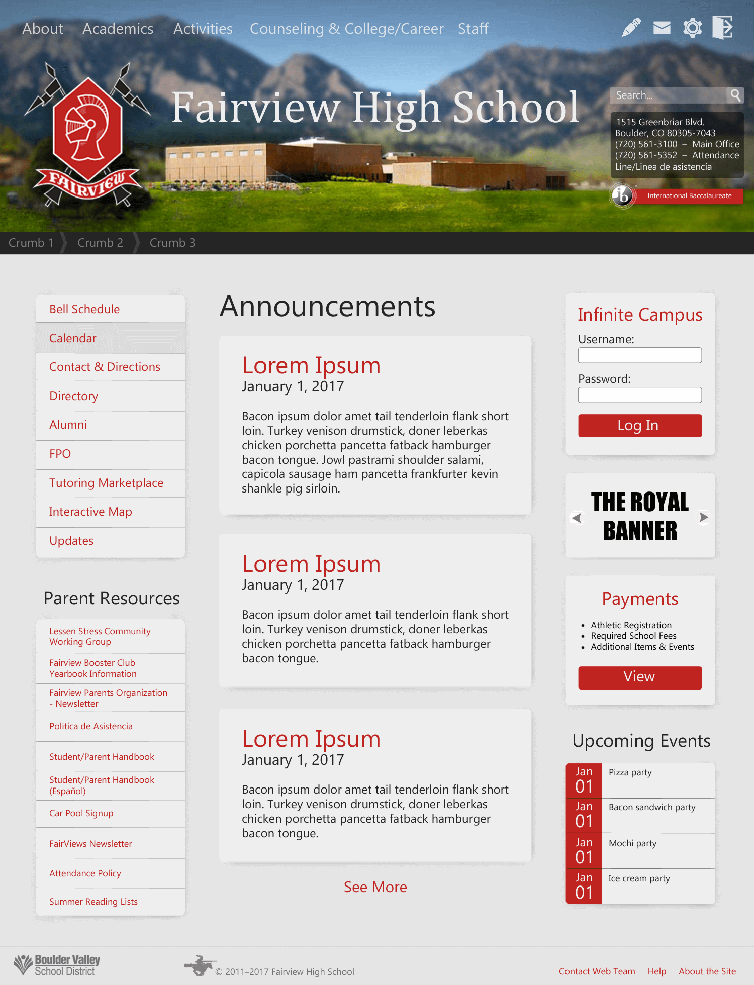
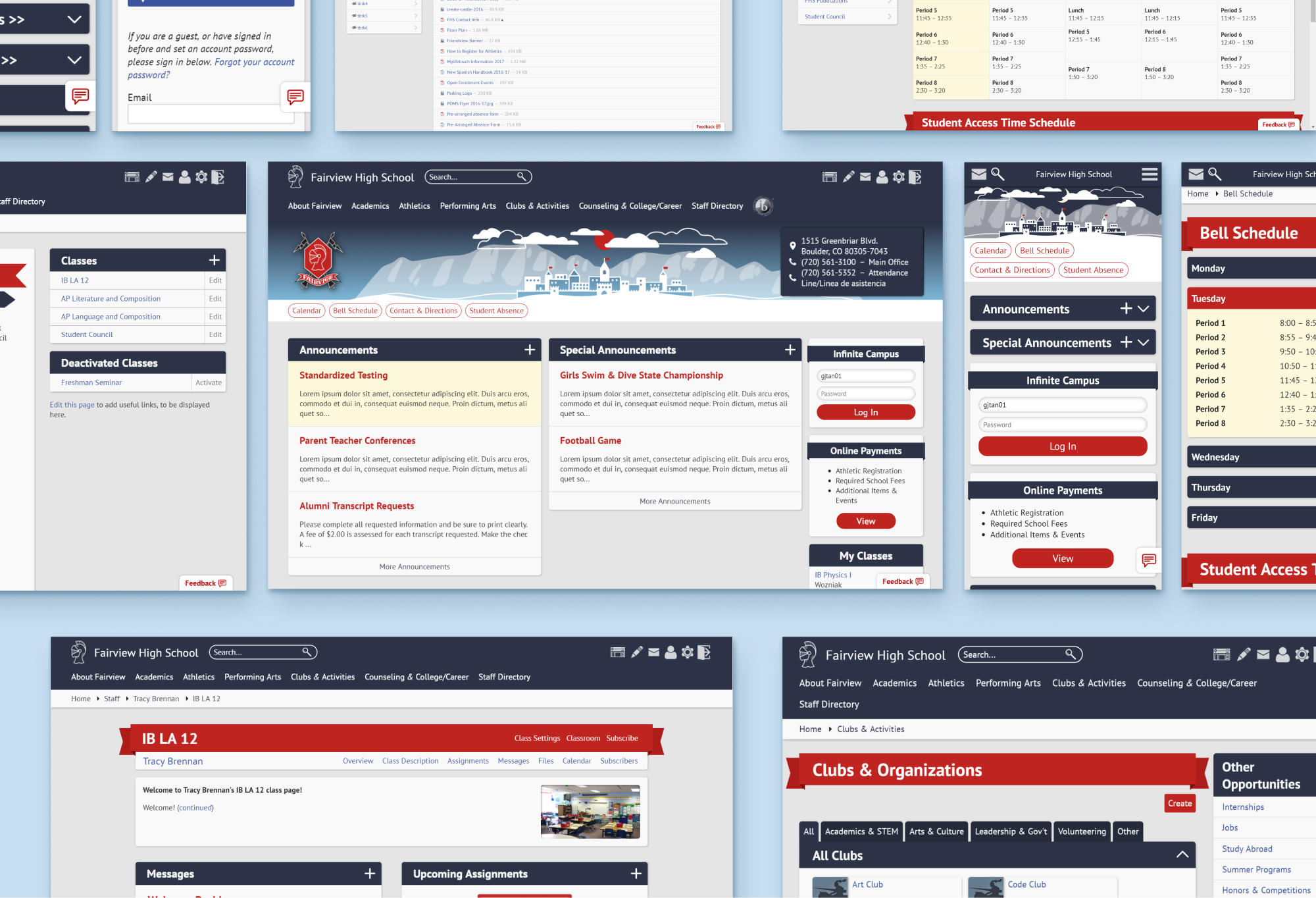
On March 26, 2019, Fairview High School’s Web Team released an official website redesign. Web Team is the student-run group that maintains, services, and develops fairviewhs.org - the Ruby on Rails web app the team’s first leaders built in 2010. I made my first contributions to Web Team in 2016, back when many of the site’s backgrounds were actually images of solid color.

If you can do something with CSS code… don’t use an image. Please… I beg you.
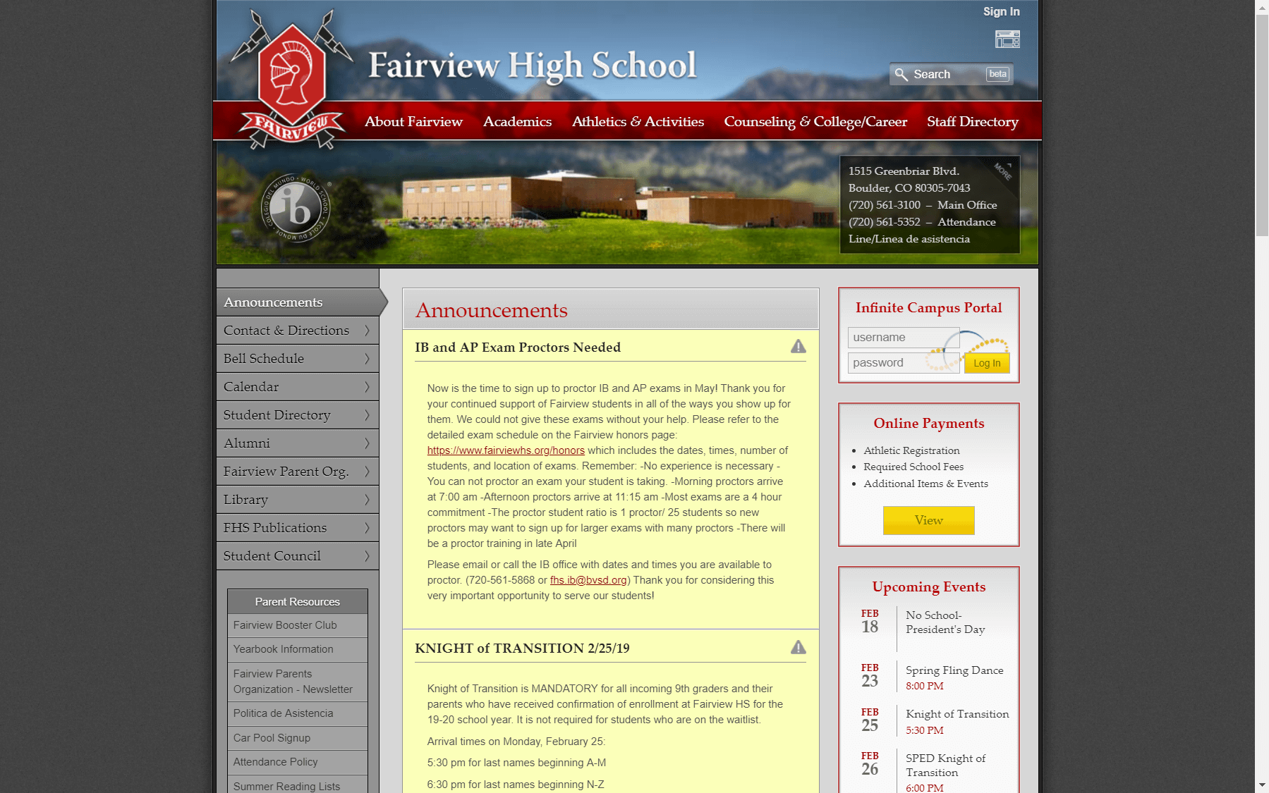
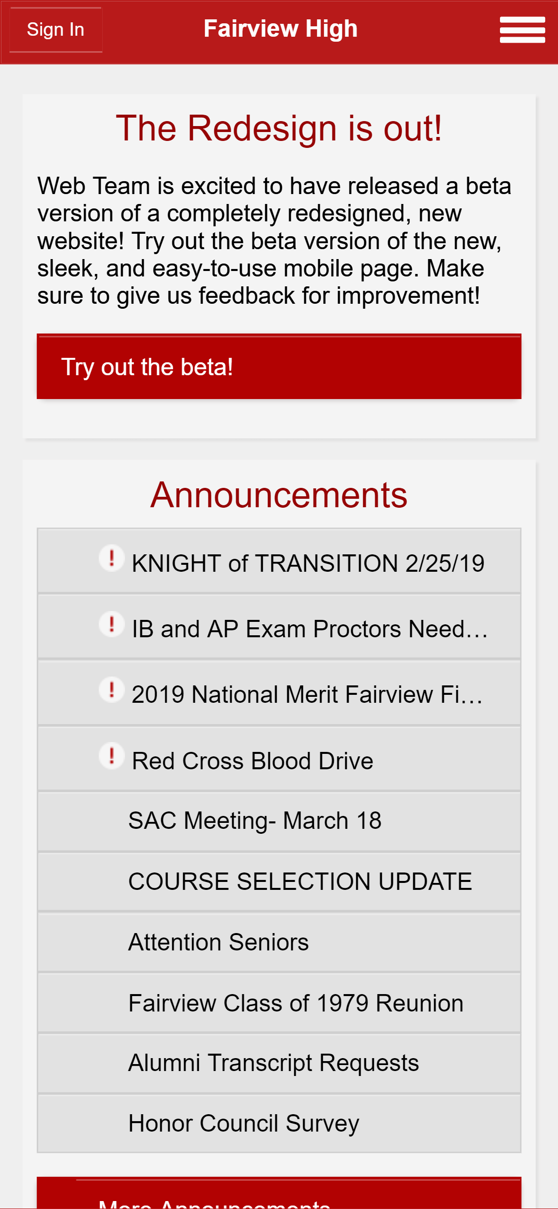
Fairview’s existing website was non-responsive, built specifically for desktop. Of its thousands of weekly visitors, more than 25% access the site by phone. These mobile users were presented a completely different design which was maintained separately and lacked half the desktop content.
At the time, I wasn’t concerned about altering the site’s content structure and I’d never even heard of the term “user experience design”. If you’d told then-me about focus groups, pain points, or other UX/UI/visual design practices, I probably would have dismissed it as some esoteric lorem ipsum jig.
What then-me was really worried about was the atrocious fact that not only were solid-color backgrounds images…
But so were solid-color borders.

Despite its problematic elements, the existing site most certainly had its merits - especially when it came to end-user appeal. There was definitely pressure for the redesign to live up to its predecessor’s image.
The first mockup I made did not live up to anything.
This was made in Photoshop Elements 11 - with love and half a brain.
With the help of some team feedback, I made more appealing alternatives near the end of the 2016 school year.
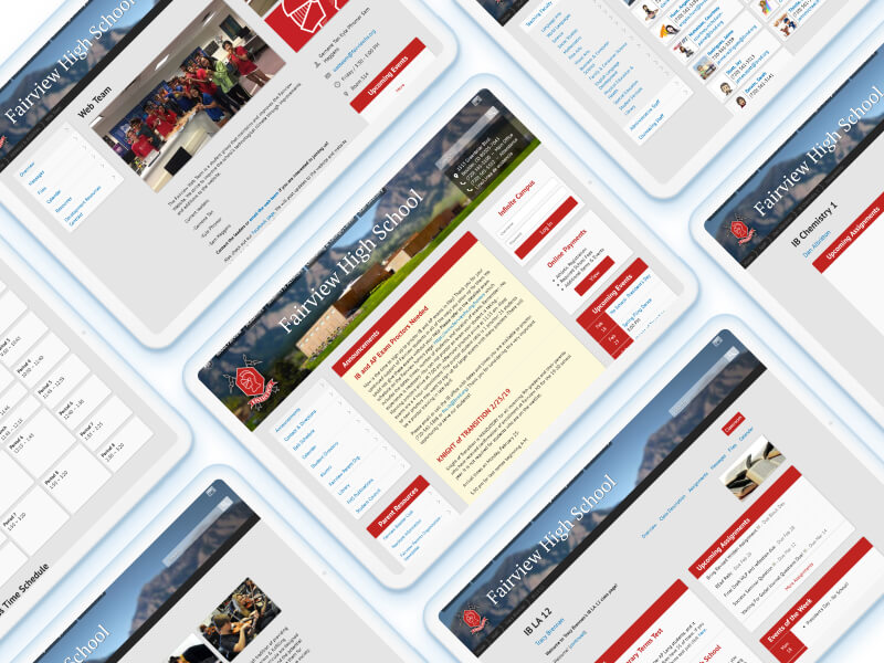
Over the entire upcoming summer, a teammate and I started developing the redesign. An enormous amount of code was written to support the Fairview website’s multitude of features - both the obscure and the essential. It was difficult to work with, confusing, and easy to make mistakes. On top of that, we were racing to complete the project by 2018, when the senior team members would be graduating.
In 2017, we released our work for optional beta testing. It was buggy, janky, and as expected, received with mixed reviews. Still, it was a huge accomplishment I was eager to celebrate.
This was also the year I joined Web Team leadership!
And by extension… the chaos that is web support.
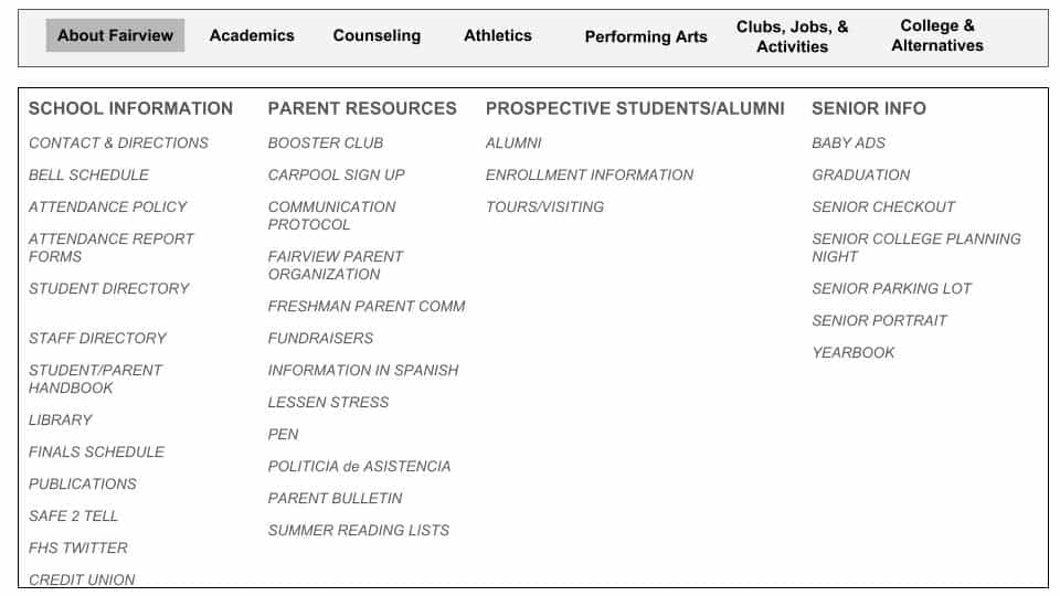
During a community feedback session, Web Team was approached by our school’s counseling department with a list of concerns. Of said concerns, none had much to do with the redesign. Instead, they had everything to do with the site’s existing content hierarchy. Parents and students were asking counseling staff questions which were answered on the website - simply because they weren’t aware that the content was available.
With bugs and broken pages popping up left and right, I admittedly forgot about the content organization issue. We were too busy repairing the redesign as it was. It was when counseling submitted a full-blown content hierarchy proposal that we realized we’d eventually have to do something about the problem.
I admit that I had my bias and reservations. We were hundreds of hours into the project and nothing terrified me more than the thought of making triple-nested dropdowns work on mobile. There was plenty of debate within Web Team. I kept second-guessing myself, switching between thinking that I was lazy for not wanting to fix a broken system, and thinking I was a pushover for attempting to implement changes with dubious projected benefits.
The struggle continued until 2019, my senior year, when the proposed content restructure seemed more viable. Web Team would try to release both the redesign and an updated content hierarchy together. Our greatest challenge was finding a way to integrate the counseling’s non-responsive content with the rest of the site. This required us to individually recode and restyle each page to match the new responsive design. It’d be an enormous feat.
To make the counseling integration possible, we built a set of component templates. The goal was for counseling’s 30-volunteer-strong content team to copy the template code from a document, paste the code into the Fairview site’s text editor, and adjust the text/code accordingly.
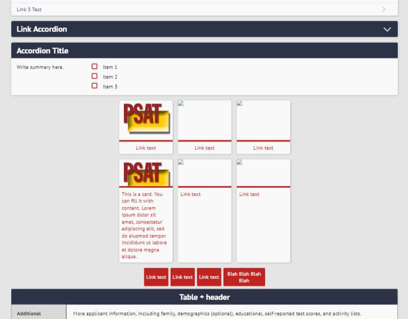
Turns out, not only was the new template code too complicated for most volunteers, but so was the existing article code and even the existing content management editor itself. I did a double take there - because this stuff had been in use for years.
That was the beauty of designing and developing for Web Team. Conditions were never ideal, resources were scarce, and you had to juggle a mountain of concerns with every decision. I was always worried about the outlook for future Web Team members. Was I leaving them a broken site they might not be able to fix? How would the precedents I establish affect the next leaders’ responsibilities?
While I was asking these questions in the interest of an organization I led, I sometimes forgot to apply the same considerations to those beyond the team. Just as Web Team would lose a sizable number of seniors each year, many of counseling’s parent volunteers left when their children graduated. They weren’t always replaced by those with the same technical know-how - in this case, the ability to understand and write HTML for articles.
It was this kind of experience that forced me to think more critically and practically about what I designed and what I built. With time, I wrote better code, learned more about digital design, and came to recognize my earlier mistakes.
While it may seem like common sense to many, there are so many important ideas/concepts this project taught me about - things I overlooked or simply lacked vocabulary for:
Research, Planning, and Asking the Right Questions
For more experienced UX folk, I’m pretty sure the alarm bells were sounding from the start.
“Where was your research?”
Well, I’m glad you asked because…

Web Team has been, by far, a group of developers - and mostly backend developers at that. Its few designers were inexperienced with research and more likely to ask “How do I design a great website?” rather than “How can I identify the needs of my audience?”. The team’s UX knowledge deficit and confusing industry verbiage certainly didn’t help.
Trust me, the first question your typical sleep-deprived high school geek would have is not “How can I create an effective design language?” and definitely not “How can I practice design thinking?”.
The issue wasn’t that we didn’t bother to collect data. It’s that we didn’t collect all the right types. As far as the visual redesign was concerned, we got plenty of feedback through the optional beta testing. Otherwise, I was limited to statistics from Google Analytics. The problem with this information is that it focused solely on how people were already using the site as opposed to what they needed from it.
Our lack of needs-based data proved more problematic when the team started switching up the website’s content structure. The only ones with a full understanding of the content problem were the counseling staff working directly with student and parent inquiries. With the help of its volunteers, counseling divided site content into categories written on sticky notes. Various community members were then asked to organize the notes according to what made the most sense.
Except, Web Team didn’t have full access to the data. Counseling’s information was presented to the team in the form of a completed site layout. I had no idea how much control research participants had over content categories or the context in which they were asked to complete the sorting activity. Making even the smallest design decisions without this understanding felt like writing in the dark.
Web Team should have conducted UX research similar to counseling’s, tested prototypes before hand, and prioritized understanding the people who use our site. Most importantly, we should have done these things and documented it in as much detail as possible - because the details weren’t there when I needed them the most.
Dynamic Content
There were times where I kept reworking the design for certain pages. They looked fine - but not consistently. The sites I built before were all non-responsive and far smaller in scale. Designing them felt very similar to print-based mediums. It was predictable and pixel-perfect. I didn’t have to worry about as many weird edge cases - no oddly long announcement titles, links larger than paragraphs, or user bios that rival this blog post in size.
I noticed that I kept visualizing the redesign on two very specific screen sizes (one for mobile and one for desktop). In reality, screen sizes are very variable. I became so upset when I’d pull up the development website, slowly shrink my browser window, and the page elements would behave weirdly or just not stack the way I wanted. In the end, the designs that worked weren’t those tailored for an iPhone mockup or a MacBook mockup, but the ones that were designed for a spectrum.
Design for Development
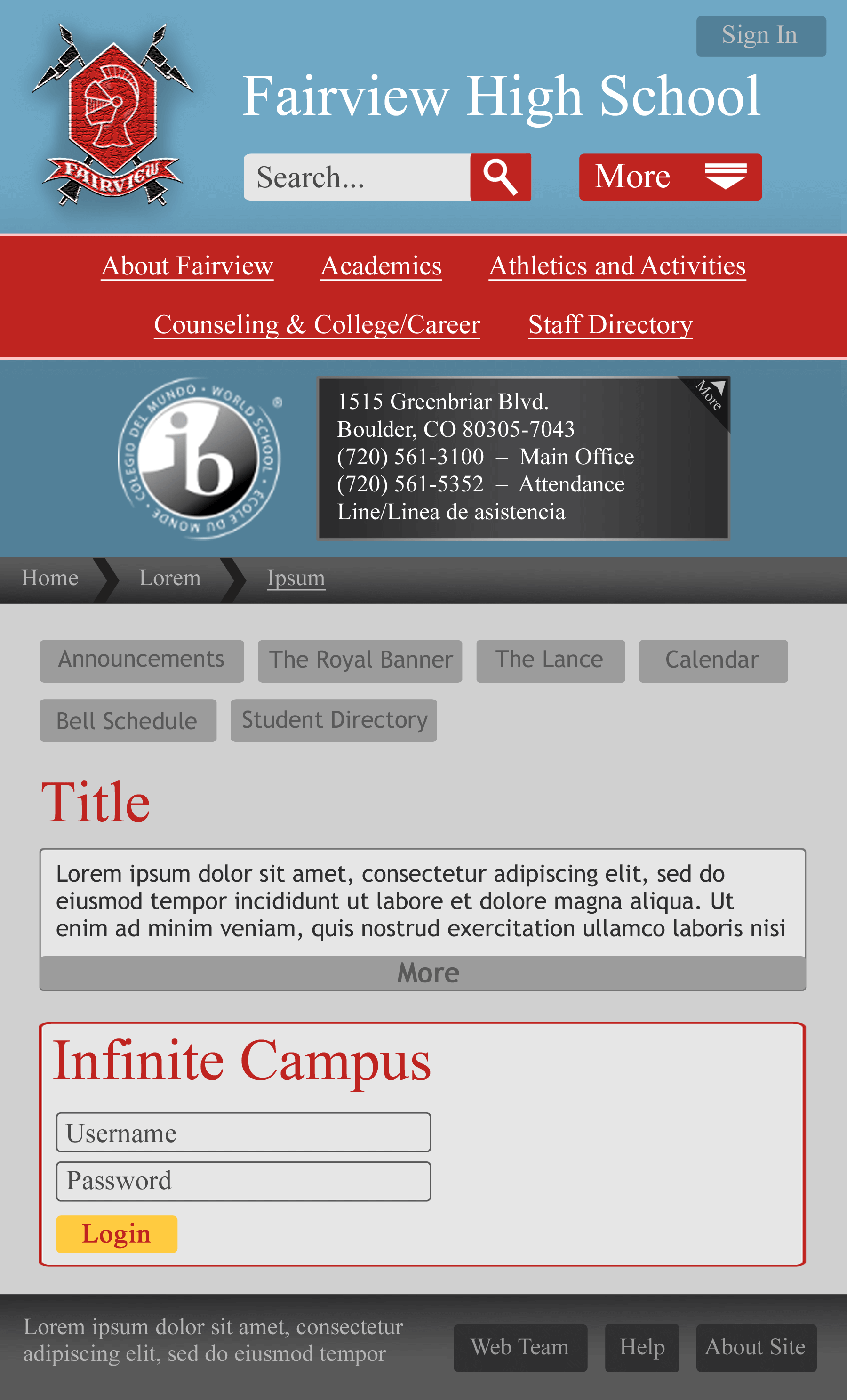
The redesign’s official release looks very different from its earlier beta test version. Originally, Web Team was aiming to give the new design a familiar feel. We re-used the same landing page image, kept some of the old site’s gray, and were careful to incorporate a lot of red (one of the school colors) to help preserve Fairview’s “brand identity”.
The landing image looked great on the old design - at a fixed width, fixed height, with the navigation links positioned perfectly atop a red ribbon. But in order to display most of the picture on the redesign, the header was made unusually tall. Not only did this push the main page announcements further down (which many people disliked), but the image’s background blur looked odd. At certain screen sizes, we had to choose between bad cropping and making the whole thing take up way too much space.
We couldn’t retake the picture at a more suitable dimension - a large, obtrusive green fence had been constructed in front of the building. No one had a larger, longer, or unedited copy of the original.
When Web Team started talking about a content restructure, we realized we’d be adding more navigation links to the header. We couldn’t make the links smaller as there were already concerns about their visibility. The idea of making the page header even taller was just… frustrating.
Instead, I dramatically changed my design approach. I knew it was important to keep site users in mind, but a good design also had to be workable for developers and scale with the site’s growth. When I finally had to dispose of my stick-to-the-status-quo mentality, I was forced to focus on actually improving our product and planning a more sustainable system.
Assumptions
Oh gosh. I don’t even know where to start. I made so many assumptions throughout the whole project - the assumption that familiar was better, the assumption that adding giant dropdowns would hurt users… the list goes on.
However, some of my assumptions were definitely more dangerous than others. One of my biggest mistakes was assuming that the systems and tools which worked in the past would work in the present.
When Web Team was creating component templates for counseling, I assigned elements premade CSS classes (controlled by Web Team through an external stylesheet) so parent volunteers wouldn’t need to touch CSS to edit the counseling articles. I thought the new code was easy to copy, paste, and modify - especially since the code the articles currently used was far more complex and used tons of inline CSS.
I forgot to take into account that the current parent volunteers weren’t the ones who wrote in the old article code. That makes a difference, doesn’t it? If anything good came out of the scandal, I realized how broken the current content management had become.
-
Counseling was giving volunteers an inch-thick guide to explain how to create a link… with illustrations.
-
As someone with web development experience, I tried using counseling’s content editor. The code box was the size of my phone screen. I couldn’t even add whitespace. I felt miserable.

Props to Fairview’s counseling department for making something out of nothing. I would have lost my mind.
On a side note, the template code we made is now being used to develop a codeless content editing GUI for Fairview.
Continuous Improvement and Change
I’m not sure if this is unique to Web Team’s circumstances, but it made me think: “What happens when knowledge acquisition outpaces a project’s development?”. I’m constantly learning new design and code skills - especially as a student.
I always had the urge to go back and undo progress so I could make part of the site look or work better. Sure, results improved and completion speed increased - but it got to a point where I had to take a step back and stop myself.
I’m still never quite satisfied with what I’ve done in the past, but experience (especially from Web Team) has helped me find a balance between perfectionism and ensuring that the team’s long-term goals could be met in a timely fashion.
Time, Time Constraints, and Time Management
We were always hurrying about, whether it was to set up development environments, fix bugs, or complete our larger projects. Looking back, Web Team’s timeline and project scope should have been more defined during the redesign’s early days. We never established a time for research, prototyping, and never planned out the project scope (visual vs visual and structural redesign).
Sometimes, the team missed the right moment. And it hurt us. But we couldn’t let lost opportunity or mistakes stop everything in its tracks. Being part of Web Team was as much about learning from mistakes as it was about moving on in spite of them.
Working as a Team
I cannot emphasize how fortunate I was to work with the team that I did. The redesign would not have been possible without their feedback, support, and countless nights of work. I believe that catching each other when we fell was what made all the difference in the end.
After all our effort, trials, and errors, I consider Fairview’s redesign a success. We released the new design along with parts of the content restructure. The integration of counseling’s content is still in progress, but I am confident that this vision will be realized by the people who made it all possible to begin with.
My fellow Web Teammers, it is my hope that you can learn from my experience and do more than I did. Be more than I was.
Good luck. ♥